
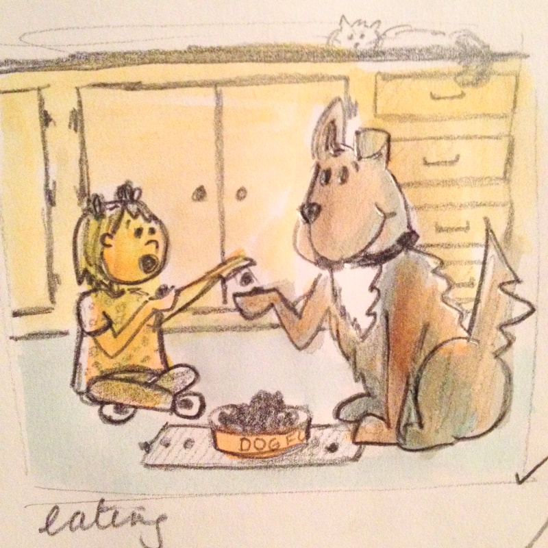
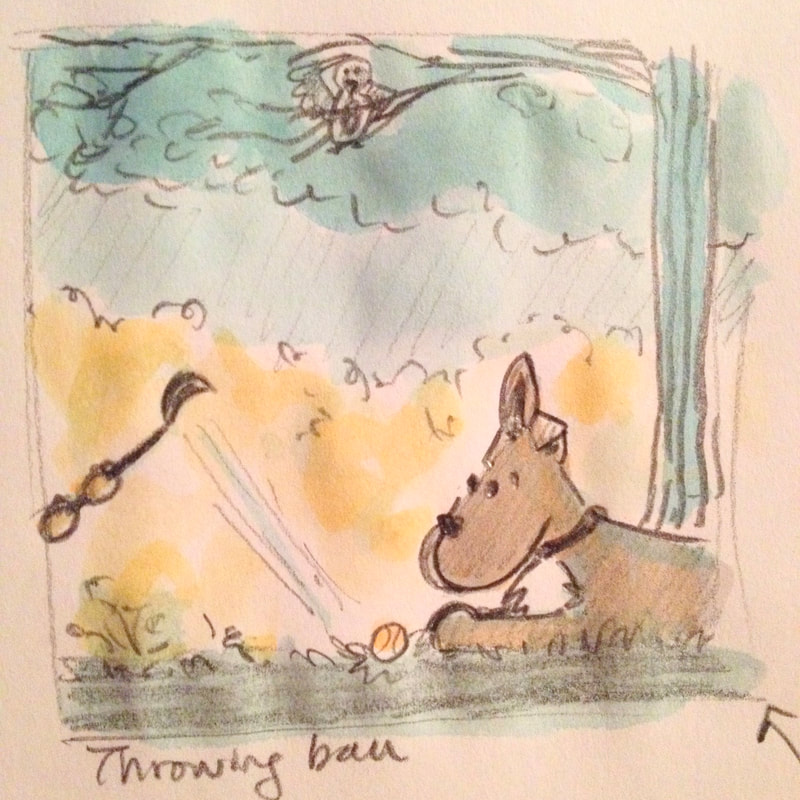
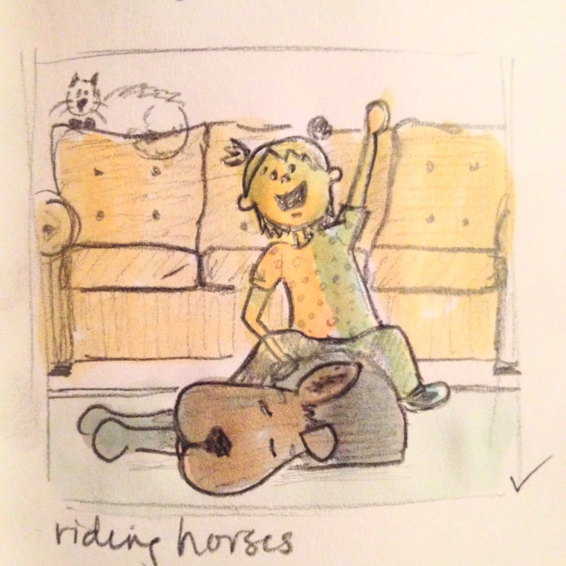
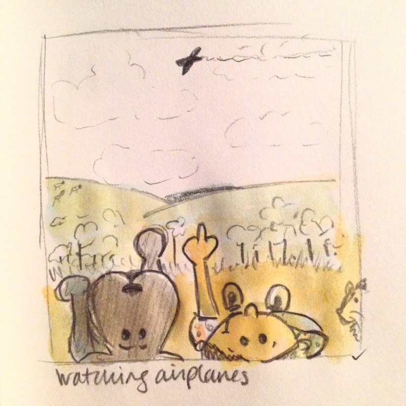
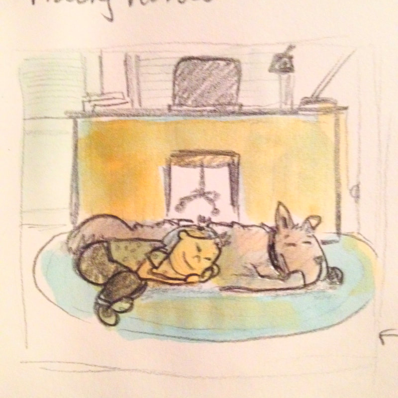
When my eldest was younger, she forged a relationship with our dog. Watching this friendship unfold was so special. I started sketching what it might evolve into in a few years. These are now factually true sketches which once were a daydream. Drew in quick sketches at first but the two-tone watercolor was needed to add the binary relationship of excitement and warmth (yellow) with the comfort and calm (blue). These five are a sampling of a collection.
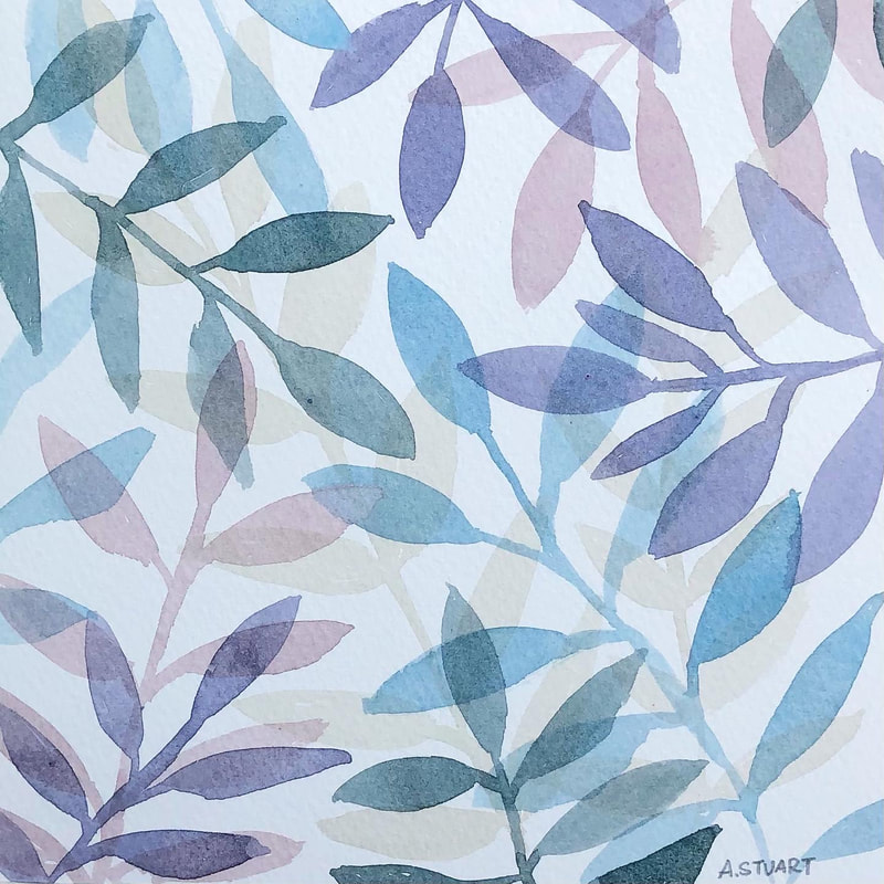
We are on our way to Edinburgh from St. Andrews via train. I brought my Derwent Inktense watercolor pencils along with a portable paint brush/water set to capture the Scottish countryside. 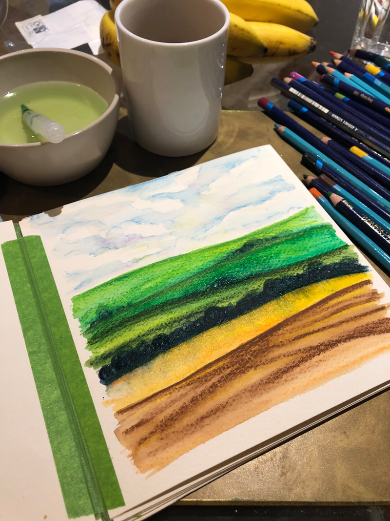 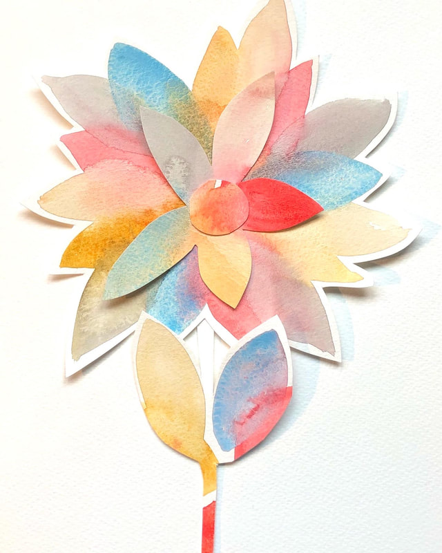 Final piece before gluing
 Pinterest has been a wonderful place for me to share and find inspiration. Recently I've been adding more of my own work to Pinterest. I'm excited to share my inspiration boards with you all as I've been collecting and pinning for a long time now.
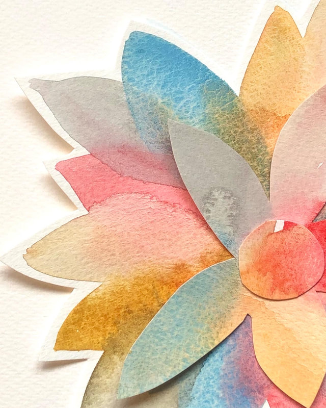
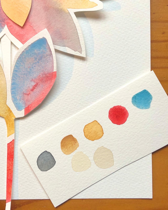
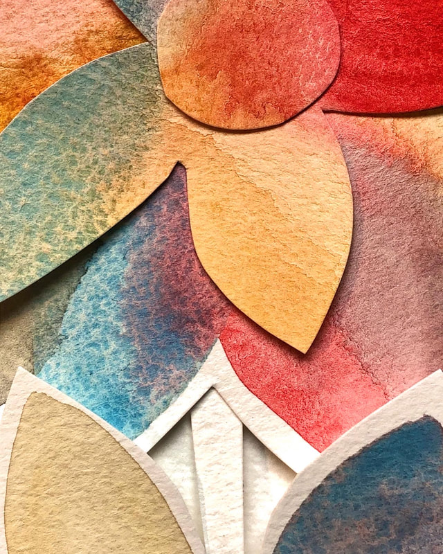
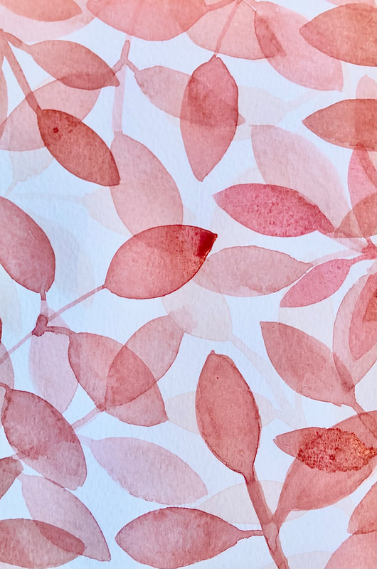
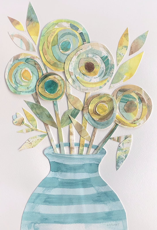
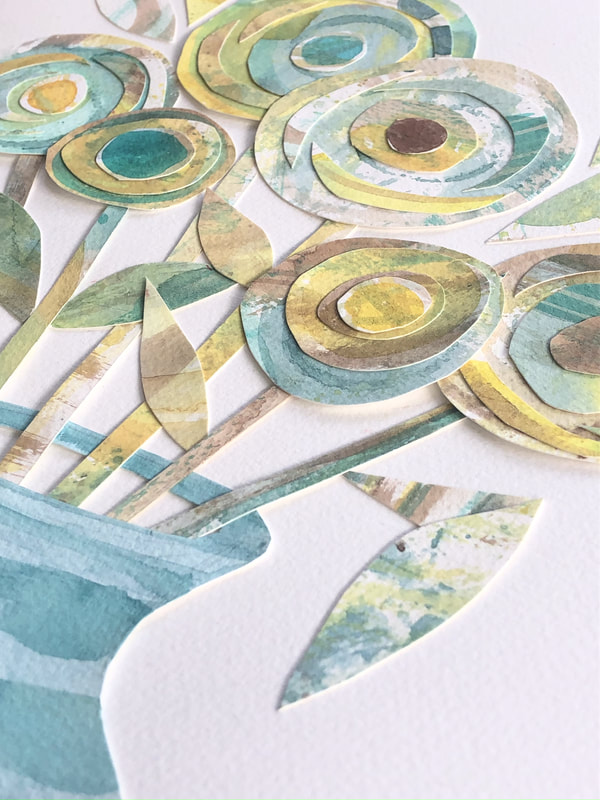
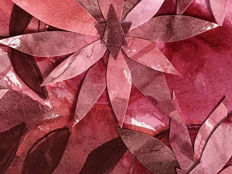
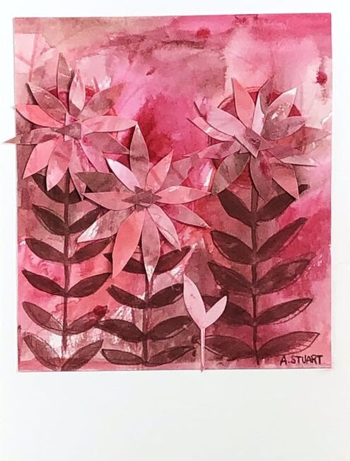
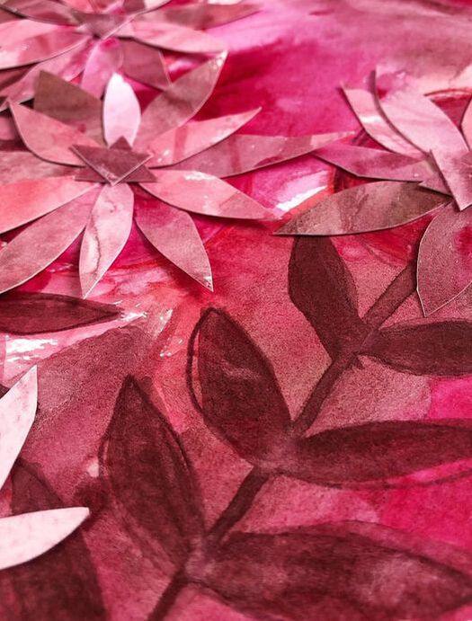
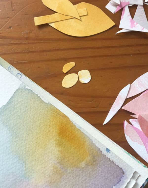
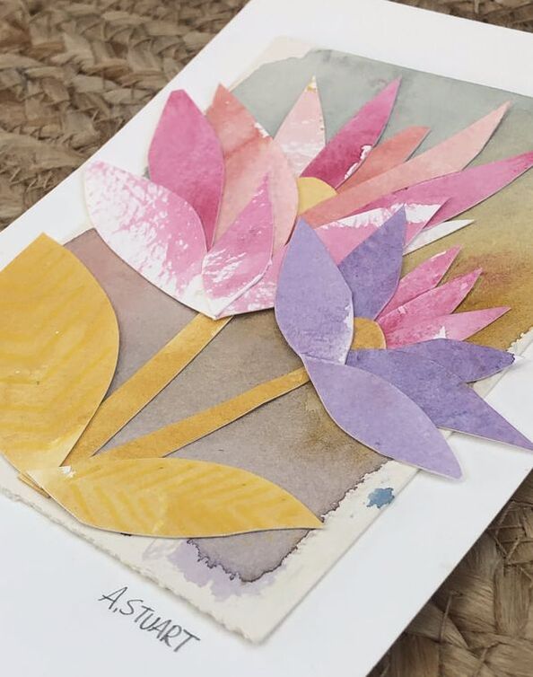
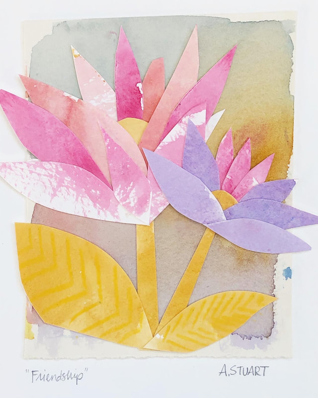 Final piece I have been wanting to try my hand at collage for a while now. Starting with watercolor washes, I chopped various shapes and organically assembled the pieces; two flowers growing together began to appear. I've really enjoyed this and would love to explore more.
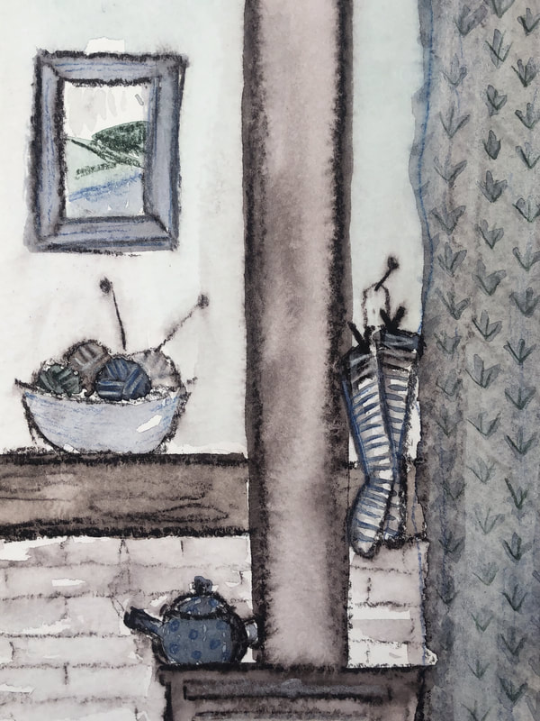
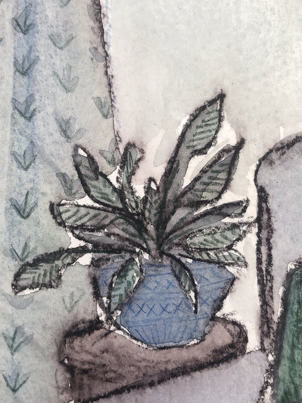
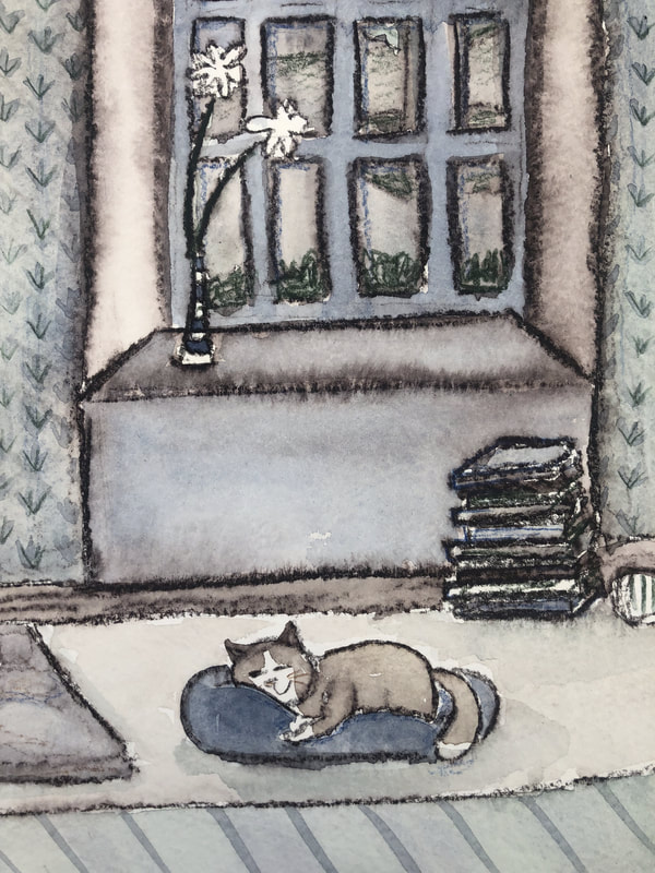
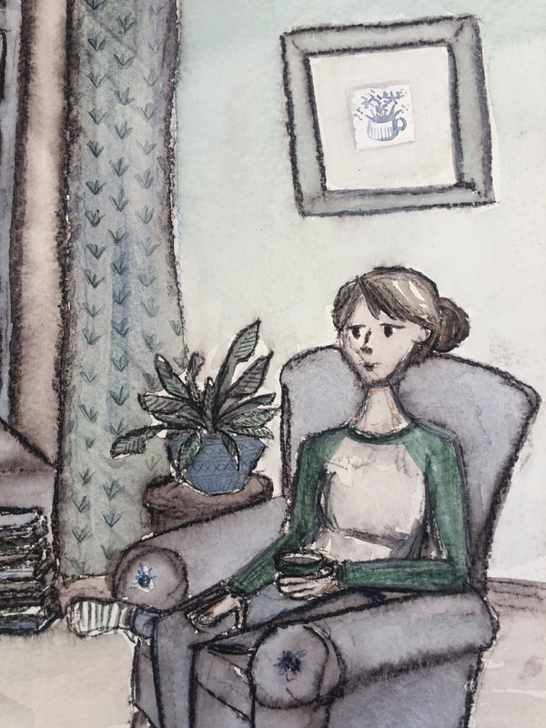
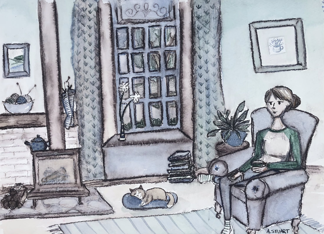 Final piece I have been wanting to use a cozy homestead as the focus of an illustration for a long time. The palette in this week's challenge seemed to suit the mood of a cozy, indoors moment. I sometimes wonder if I should begin illustrating more often as I find so much joy in creating worlds rather than mimicking what I see on a landscape. What you see is somewhat of a dream home for me: kitty cat by the wood burner, comfy chair and clothes, warm cuppa, Georgian window, a sweater waiting to be knit, stacks of books to be read, and socks warming naturally. Hope you feel cozy and at home when you look through.
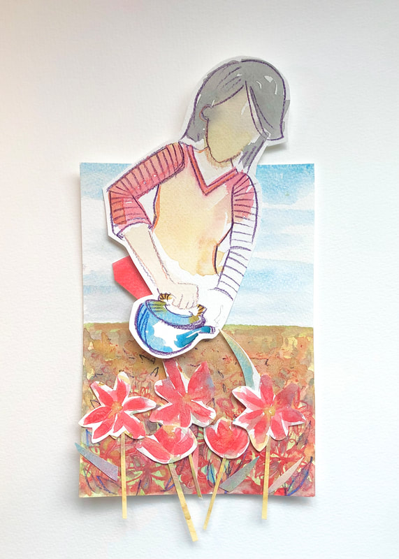
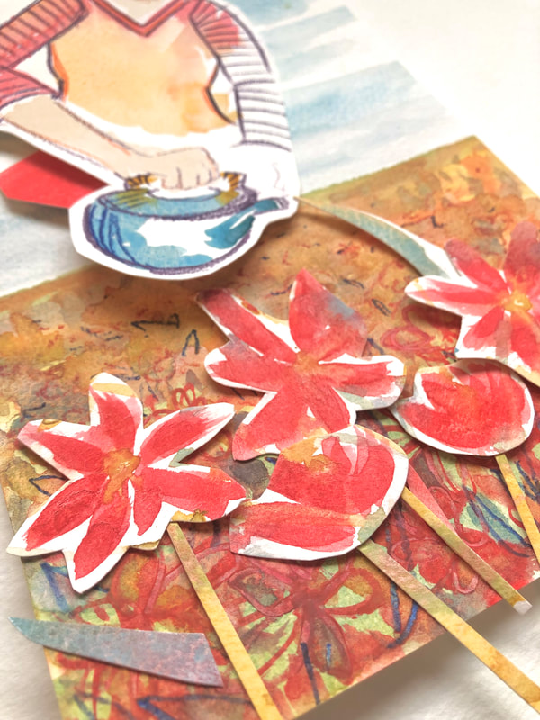
Creative ProcessI sketched in the darkest color on the palette so I would have the definition at the end (see picture one). Then working in thirds I applied the three additional colors. What I mean by "working in thirds" is I added three locations for each color to make the piece feel balanced. Then I could add dabs here and there to create more depth (see pictures two and three). Once the initial watercolor was painted I then went in with watercolor pencil to add details to items like the flower pot, curtains, and yarn. |
Categories
All

Images are ©Ashley Stuart. All reproduction or use of images is prohibited without written consent. If you see an artwork that you would like to own, but it's not in the shop, get in touch and I'll try to make it happen!
Archives
July 2024
|


 RSS Feed
|
Ashley Stuart is a painter, illustrator, and collage artist based in Maryland, USA.
|
© ASHLEY STUART 2024. ALL RIGHTS RESERVED.