|
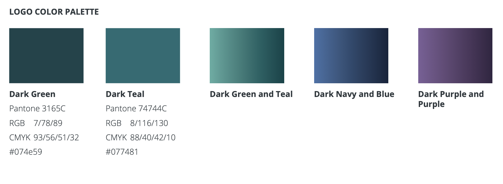
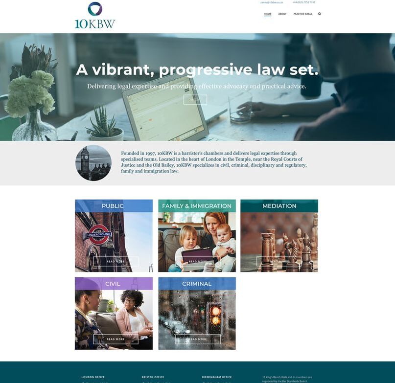
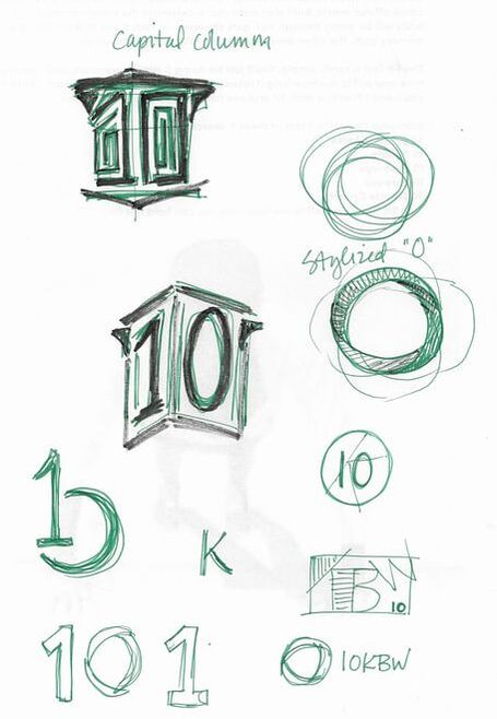
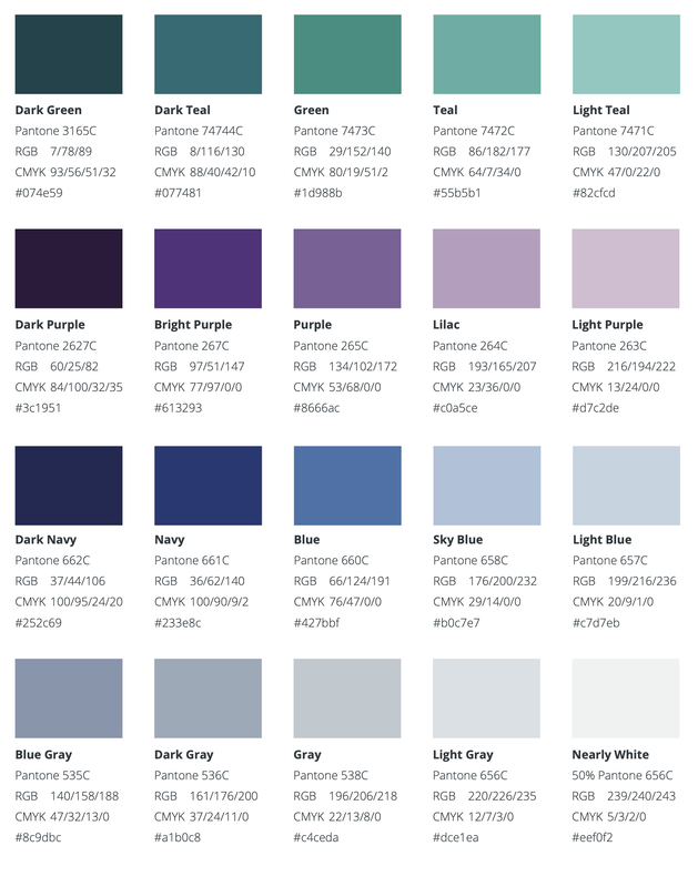
10 King's Bench Walk is a law firm in London specializing in a number of core practice areas. I was approached by a law member to create a new brand. The solution demonstrates the coming together of the people, their foci, and the skill and knowledge of these core areas.
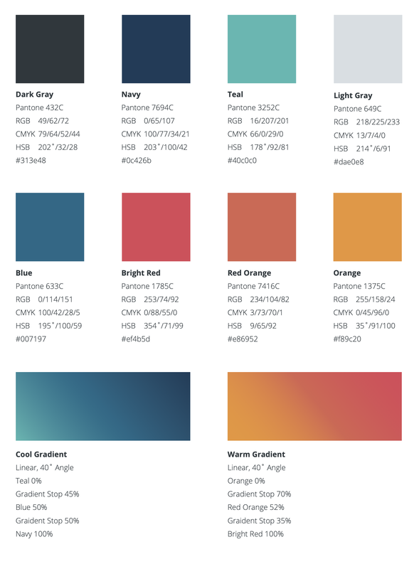
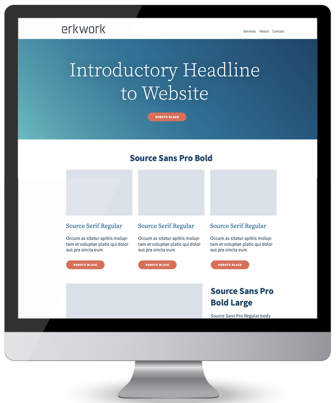
I developed a design proposal that showcased an a la carte menu of services to fit the client's budget, proposed and met a delivery schedule, wrote the contract, upheld expectation management, provided customer service, provided invoicing, held phone and video client meetings, assisted in the web developer meetings, and offered a follow-up consultancy. A start-up in Chicago as me for a new logo, typography, and color palette for their consultancy business. Working with a strong type for the mark was key, especially with the simplicity of sans serif and slab serif lines. The three logos above were the initial concepts; the chosen concept is below.
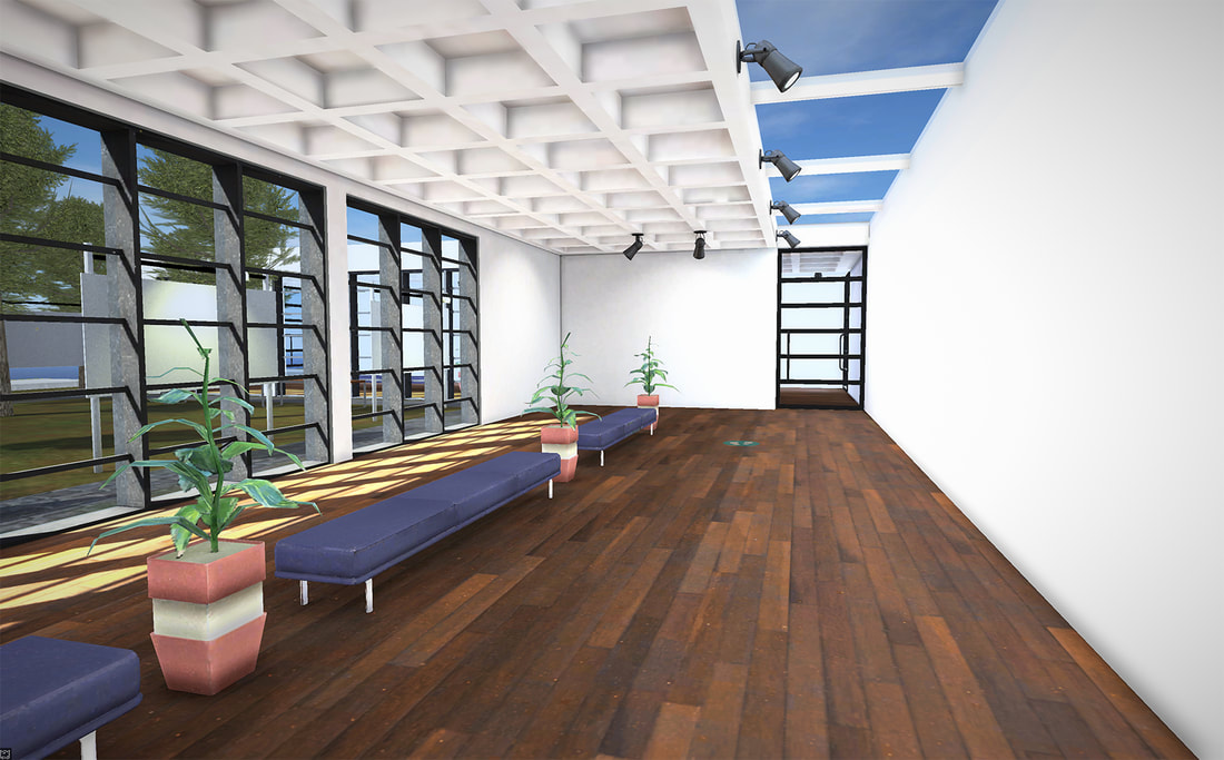
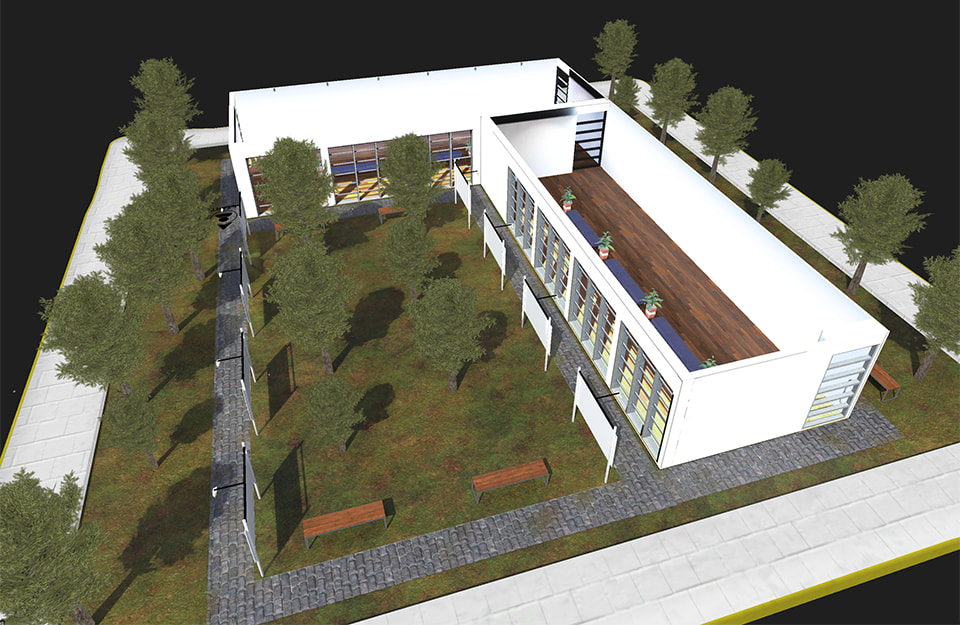
Collectors will have the chance to browse the Just Beyond collection in a beautiful and modern virtual exhibition space. By using a computer mouse or keyboard arrows, one can "walk" through the space and view the artwork on the walls.
I'll be reshooting my artwork this weekend (morning light has beens superb lately) and get my art into the virtual gallery in time for the Collectors-only pre-launch on September 4th. I'm considering one wing for the framed originals and one wing for giclée prints.
If you build an exhibition, send me the link as I never turn down a gallery visit. I've entered my bad logo into the Fuzzco's How Low Can Your Logo? challenge. So much fun to create – it gave me the heebie-jeebies the entire time. But now, it's time to VOTE! Check out the entries and vote for the best worst logo. I hope it's mine :) UGH, seriously ugh.
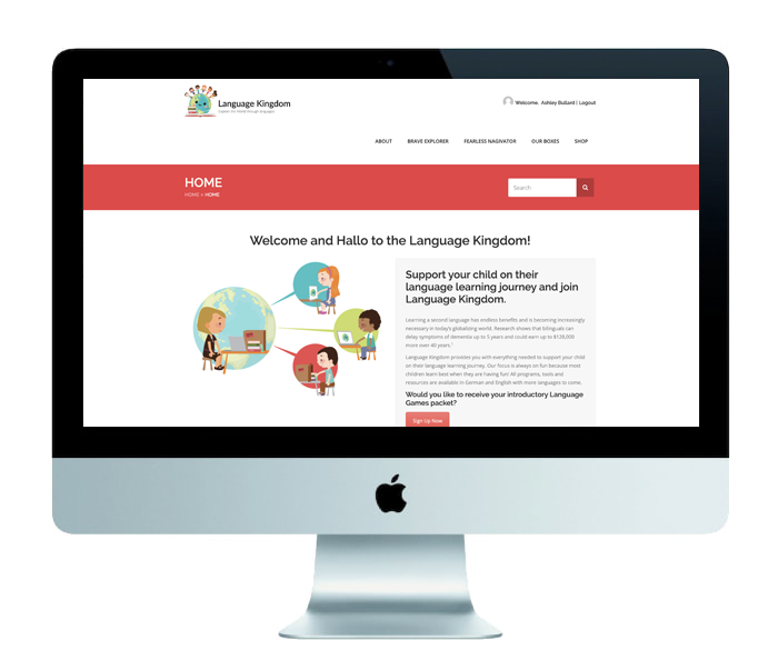
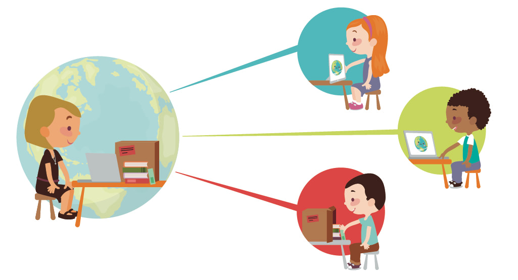
The Language Kingdom is a subscription-based language learning company for children. Maria, the founder, is a joy to work with. Using the WordPress theme she selected, I customized and branded a new website. I also illustrated a descriptive image of how Language Kingdom works, as well as two program icons and an autism awareness icon.
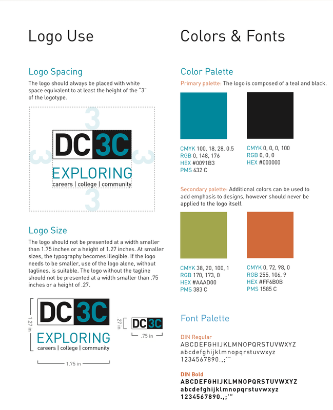
One my last projects as a senior designer at Project. Bittersweet and one I will always remember! Strategized the program name and tagline with my creative director, designed the logo, created the program hashtag #exploreDC3C, and developed the DC3C brand through a style guide and brochure.
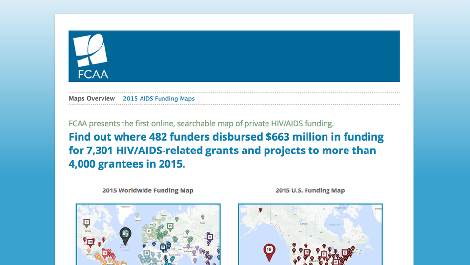
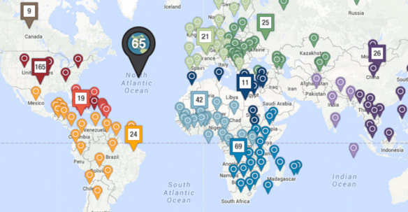
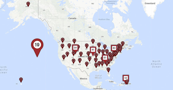
Designed and developed an interactive website, that mirrors the FCAA site, to be used in conjunction with the annual resource tracking report. Features two searchable maps showcasing AIDS funding throughout the USA and the world. The maps are defined by state, country, region and world contributions.
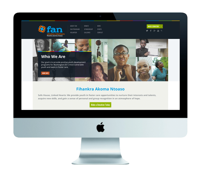
Developed a new logo for FAN DC, a DC-based foster care program. Found a suitable WordPress theme and customized the new FAN DC website. Website features online forms, featured partners, online donations, galleries, and program information.
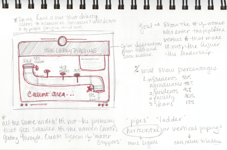
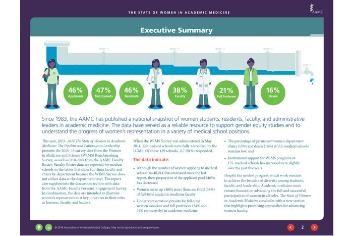
Of the many infographics found in the 2013/14 interactive report, the "leaky pipeline" infographic was the most compelling and interesting to create. The client wanted an introductory infographic representing the decreasing number of women found in higher academic medicine positions. The pipeline represents the industry and the water represents women in the academic medicine field. The pipeline remains the same throughout their career – it doesn't grow or shrink. The women (or water) is experiencing a restriction to access to certain points in the pipeline, or these higher positions, thus creating a smaller output. The end result displays four women on a path from applicant to dean, each experiencing various "locks" within the pipeline that restrict access to higher positions.
|
Categories
All
Images are ©Ashley Stuart. All reproduction or use of images is prohibited without written consent. If you see an artwork that you would like to own, but it's not in the shop, get in touch and I'll try to make it happen!
Archives
July 2024
|
|
Ashley Stuart is a painter, illustrator, and collage artist based in Maryland, USA.
|
© ASHLEY STUART 2024. ALL RIGHTS RESERVED.






 RSS Feed