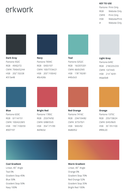
Logo & Color Palette
|
Overview
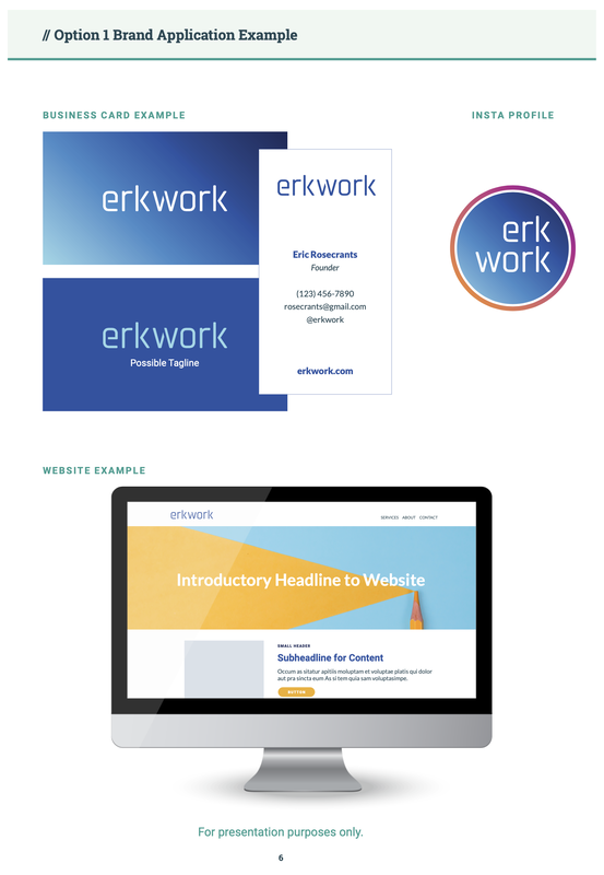
Erkwork is a start-up consultancy based in Chicago, IL specializing in developing systematic solutions for COOs of large-scale non-profits. To initiate the brand, we talked about the background of the company as well as the future. I found it essential for the brand to be clean, clear, and concise with engaging colors and legible typography.
|
Duties
|
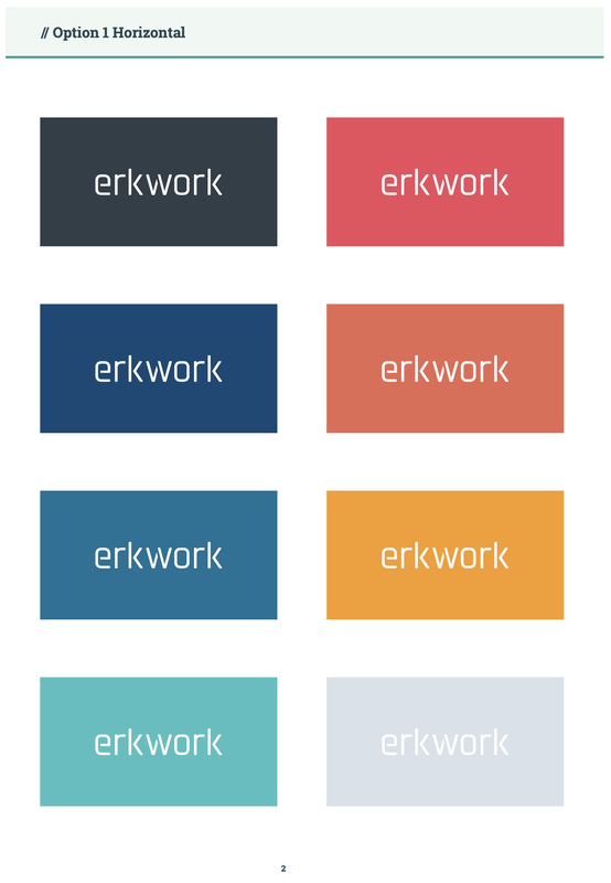
Other Options
|
|
|
|