Logo Design & Color Palette
|
Overview
10 King's Bench Walk is a law firm in London specializing in a number of core practice areas. I was approached by a law member to create a new brand. The solution demonstrates the coming together of the people, their foci, and the skill and knowledge of these core areas.
I developed a design proposal that showcased an a la carte menu of services to fit the client's budget, proposed and met a delivery schedule, wrote the contract, upheld expectation management, provided customer service, provided invoicing, held phone and video client meetings, assisted in the web developer meetings, and offered a follow-up consultancy. |
Duties
|

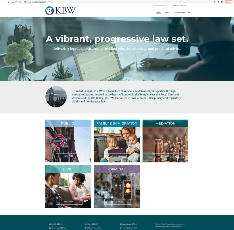
A Look at the Process
A page from the sketchbook
|
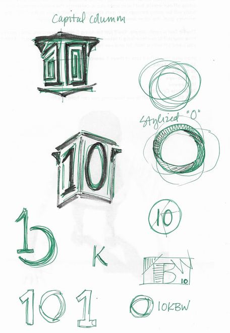
Guidelines Sample
|
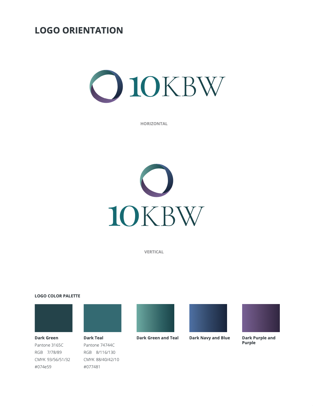
Guidelines Sample
|